GT-Viz is a browser-based tool for visualizing geospatial and temporal data from SPARQL endpoints. You write a SPARQL query, provide the SPARQL endpoint for example FactGrid or Wikidata, and the results appear on an interactive map with a timeline.
It was built by a group of students at RWTH Aachen University as part of the Knowledge Graph Lab course.
The only input needed is a SPARQL query. A set of built-in example queries covers FactGrid (Thirty Years’ War battles), Wikidata (Napoleon, WW1 & WW2, Magellan and Columbus voyages, Olympic venues), and can be loaded for testing the functionalities. The sidebar holds a SPARQL editor with syntax highlighting and validation. A Help panel documents the expected query variables.
The tool reads these variables from your query results: ?location (WKT point), ?time (date), ?category, ?parentCategory, and optionally ?name, ?description, and ?pathId.
Map View
Query results appear as markers on an OpenStreetMap base layer. Parent categories each get a distinct color; sub-categories within a parent are separated by fill patterns. Clicking a marker shows its name, description, category, and date.
Two display options can be toggled: whether to draw connecting lines between points that share a ?pathId, and whether to show points that have no date.
The Group Visibility panel shows the full category hierarchy from the query results. Individual sub-groups or entire parent categories can be toggled on or off. Item counts are shown at every level.
Timeline and Animation
The timeline at the bottom filters the map to a selected date window. Drag the handles to set start and end dates; the map updates immediately. The Play button animates the window forward through time at an adjustable speed (configurable in days, weeks, months, or years per second).
Historic Map Overlays
As an experimantal feature it is possible to load historic maps. The historic maps are overlayed on the base layer as they only cover a small portion of the globe. For testing we provided a small set of over 20 different historic maps. Only thing needed to integrate such a historic map is a tile server serving the map thus the set of supported historic maps can easaly be extended.
Click the lightbulb icon and select “FactGrid: Battles of the Thirty Years’ War” — the endpoint and query fill in automatically.
Click Run. Battles appear across central Europe; the timeline sets itself to 1618–1648.
From there, use the Play button to step through the war year by year, the filter panel to isolate specific belligerents, and the Map Config tab to add a period map beneath the markers.
Feedback
GT-Viz is a student project in its early stages. We are looking for feedback from the FactGrid community on what works, what is missing, and what would be most useful.
William Taylor’s typesetter stumbled over the date which Robinson Crusoe’s manuscript was spelling out for his page 46: 1659, “the same Day eight Year that I went from my Father and Mother at Hull“. Either this was a mistake or he had been wrong with the date that was now stated on page 7. There Crusoe was claiming that he had left his parents in 1661. Everyone was in a hurry, so he left two blanks for further clarification, the readers would be able to insert the right date once that was clearer.
First edition of Robinson Crusoe, 1719, omitted dates on p. 46.
The Errata at the end eventually settled the question: It should have been 1651 on page 7. No one had the nerves to replace 16 octavo pages for the correct reading.
The book that was to become a bestseller within less than two weeks was packed with historical detail. If indeed the author was born on the 30th of September 1632, he had to be a man of 86 years by now (DeFoe was in his late 50s, just by the way). Crusoe’s eight voyages came with numerous internal dates and even with geographic coordinates where the author had to spot his island for instance.
The itineraries are a good test ground for visualised searches on FactGrid.
Q219323 is our item for the volume as it was published on the 25h of April 1719. To avoid the interlacing of information I generated an item for the book, an item for Crusoe, the man (Q230282) eight items for his voyages (Q393587 to Q393594) and even an item for Crusoe’s island. All these items have specific context statements on them that allow to single them out as a rather fictional subject matter. Creating the individual items has, at the same moment, the charm to allow the use of all the properties we have created for “real” things.
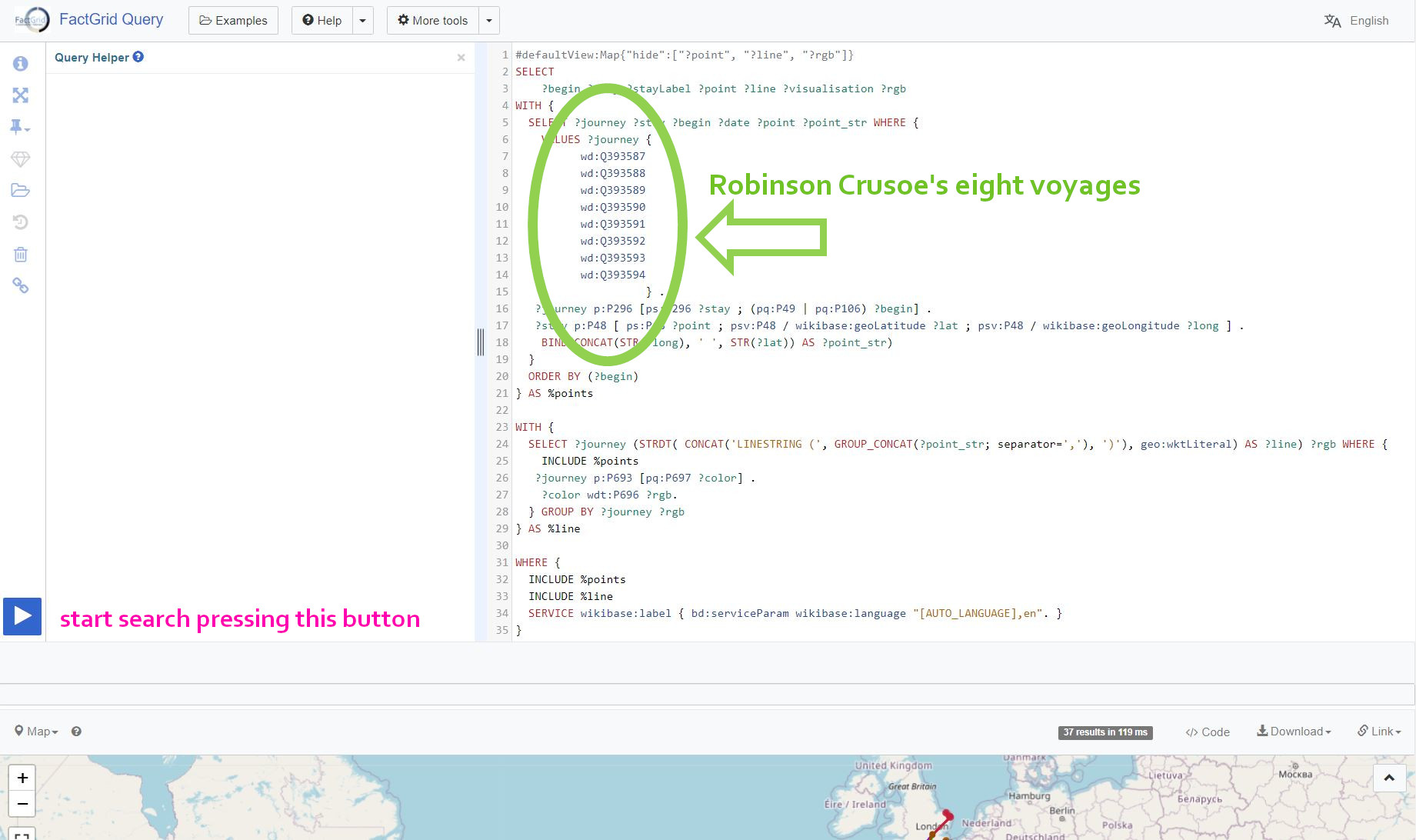
James Heald and Bruno Belhoste provided the script I am employing in the following searches. Ignore the script’s complexity. The nice thing about this script is that you can modify it to run it on your own Q-numbers. This jpg shows you where you will have to list your items:
SPARQL script to bring Robinson Crusoes first eight voyages onto a map
No need to copy the script by hand. This is the search: Crusoe’s first eight voyages, that opens the Query Service with this very script. Press the blue button and you get the map of all eight journeys in one picture. Replace the Q-numbers and you will have your own itineraries on the map.
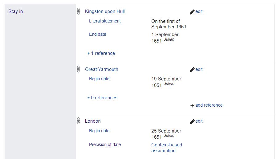
The script is looking into the items listed in lines 7-14. On these items it is looking for P296 statements where the person or group of travellers were staying. The query goes from there into these places to collect the various geographic coordinates. The visualisation will connect these with lines in the sequence of dates that should be given on the various stays, whether as dates of departure (P50), of arrivals (P49) or just as dates (P106) — all three properties are taken into account in line 16. Take a look into the item for the first voyage to see how you have to inform your item(s).
Screenshot FactGrid item with dates
And this is the picture which the query will create:
All eight voyages of Robinson Crusoe’s volume 1 in one picture.
You can change the colours: The information for them is on each item (where you will find a map link with the colour in plain text).
Where do I get the code to embed such an image on web pages?
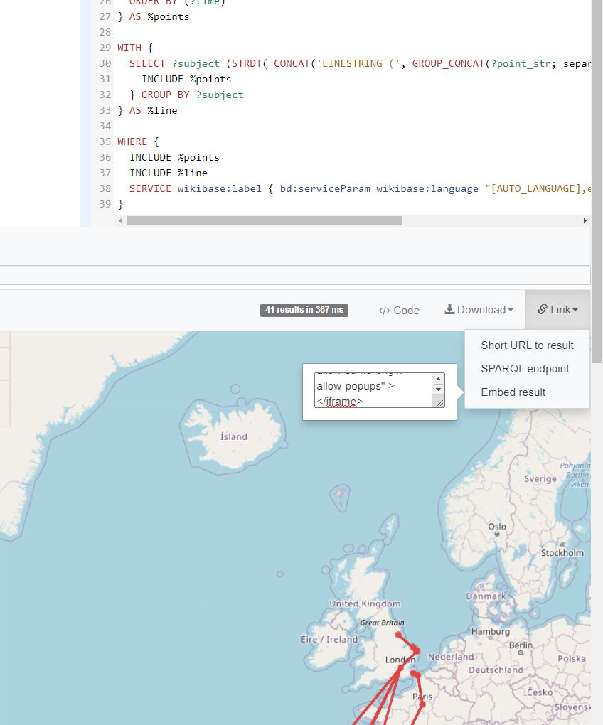
The picture above was not a jpg. You could zoom in and even edit the SPARQL query that generated the visualisation. Whenever you perform a search on FactGrid you cannot only download the data, but you can also get the query as embedded code:
Screenshot, where the embedded code is to be found.
And if your author does not give any dates, just the different places one by one? — like Gil Blas (Q390697) in his history? No problem. You can sort the locations with P499 statements one by one or create any kind of superior sort string as I did in the following Gil Blas search. I am using here the book’s segmentation: 1-1-14 is volume 1, book 1, chapter 14. Replace the P49, P50, P106 date properties for the P499 (number) or P101 (sort string) query to get the respective series of events.
The visualisation is, as I see it right now (on 4 February 2022), incomplete. I am still reading these books slowly whenever I have nothing better to do, and Gil Blas has just left Madrid. I choose this example as it demonstrates the advantage of embedded code.
Tracking Gil Blas of Santillana.
The embedded visualisations always give their pictures as the database provides them the moment the page is opened. The windows are communicating with the database — what is even better: you can communicate with the database right here on this WordPress blog, as the each of the embedded images comes with a menue (on its right hand side, hover over it) that gives you direct access to the SPARQL search engine. Correct or add data on the database (you need an account to do that) and the new information will appear wherever an embedded visualisation will be checking the database — today or over the next years.
More than aesthetics…
One would love to give such visualisations on old maps. click the following link for the visualisation of Crusoe’s eight voyages on https://mappingwriting.com/. My Guinea has moved from the present Republic of Guinea to the early-18th-century location as given on the maps DeFoe could get in London:
“Negroland and Guinea with the European Settlements, Explaining what belongs to England, Holland, Denmark, etc”. By H. Moll Geographer (Printed and sold by T. Bowles next ye Chapter House in St. Pauls Church yard, & I. Bowles at ye Black Horse in Cornhill, 1729, orig. published in 1727)
A line from DeFoe’s London to this Guinea has the smell of modern air traffic. Crusoe’s captains were travelled along the coast lines wherever they could. Yet following their practices is ugly as we do not have these routes in the machine. We are connecting locations, and here I have already interpolated two costal places and two groups of islands to avoid the straight trans-African passage without a conformation from the book.
Crusoes first two journeys.
The nice thing about creating all this on FactGrid is that you can add any amount of further information on these stays and journeys, like the page references, connections to other items or in depth information on places. So lots of things to play with and to do with your own data on FactGrid.